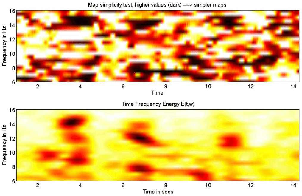
Figure 5. MaSTiF approximation for the spindle data shown in Figure 4. The lower panel depicts the global time frequency energy. Darker colors indicate strong energy concentrations around the specified time-frequency region. The upper panel shows the results of the simplicity test. Darker colors indicate simple maps likely to be generated by simple configurations of the generators. |